“Pendant Pair Paintings”
14 April 2007
opening reception on Friday,
9 March, 7-9 pm
Morgan Fisher
Pendant Pair Paintings
9 March - 14 April 2007
opening reception on Friday, 9 March, 7-9 pm
The Pendant Pair Paintings
The Pendant Pair Paintings continue my interest in making paintings that question the unspoken assumptions that limit painting.
These unspoken assumptions produce what I have called painting as usual. Painting as usual is a painting that is (almost always) rectangular and that you can hang wherever you want. Painting as usual tends to be at the scale of the easel picture, readily portable and ready to hang anywhere. Such a painting, when it is one object—a painting as a single instance—is painting as usual. Such a painting can only be a victim.
With painting as usual, whatever claims the painting wants to make are annulled in advance by the painting’s being within the confines of a rectangle, already something that will end up as simply another element in an arrangement that serves a larger agenda, whether curatorial or decorative. Even most abstraction today is painting as usual, because it treats the rectangle as a given space that the painting fills up. So the painting is in reality a picture, and a picture, it goes without saying, is painting as usual.
In a word, painting as usual, no matter what it stages within the rectangle, is submissive. The condition of painting as a rectangular single object (again, at the scale of the easel painting) is what makes this so.
(An early announcement in modernism of the inadequacy of easel painting as a single canvas was Rodchenko’s Pure Red Color, Pure Yellow Color, Pure Blue Color, a work that consists of three physically separate canvases. The turn away from the single canvas is confirmed most explicitly by the practice of making and showing painting in groups or series, as Frank Stella did in his early career. The paintings were sold as individual works, but the identity of each is confirmed and emphasized by seeing all the members of the group together, when we can see how they are alike and how they differ, if fact they do. And when we see one of these canvases by itself, our knowledge that it is a member of a group enables us to see the absent group of which it is a member. The one canvas that we are looking at is richer for our knowledge of the group of which it is a member. But this question of individual canvases in relation to a group with properties in common is too large and complex to consider further here.)
I want to bring into visibility the assumptions that underlie painting as usual to call them into question and to move painting beyond them. I want to make paintings that are not submissive.
The Pendant Pair Paintings move beyond painting as usual in two ways: first, by being other than a painting as a single instance; and second, by imposing conditions on how they are hung in relation to each other.
This group of Pendant Pair Paintings consists of three separate works that as arranged here are a larger work that can be called a painting installation.
The Pendant Pair Paintings are a variation on the convention of the pendant pair, long a part of the history of painting. A pendant pair is two separate paintings that together make a unity that is other than either painting by itself. A pendant pair is one work in two parts. Pendant pairs are conceived of together and executed together. A classic subject for a pendant pair is a husband and wife. An example by Rembrandt is Portrait of a Man Rising from His Chair and Portrait of a Young Woman with a Fan, both painted in 1633. When pendant pairs are portraits they are called paired portraits. Of course the portraits are meant to stay together, as any pendant pair is, but these two paintings are separated. The portrait of the woman is in the Metropolitan Museum of Art in New York, and the portrait of the man is in the Taft Museum of Art in Cincinnati. In 2005 the wife visited her husband at the Taft Museum, so after a long separation they were reunited but only for four months, then separated again.
In pendant pairs that are paired portraits, each painting includes one figure, and the paintings are hung on the same wall more or less close to each other. Sometimes they are side by side; sometimes they are separated by a feature of the architecture, such as a fireplace. Both paintings in a pendant pair are identical in size and shape. This identity is a simple kind of symmetry, and this symmetry is underscored if the paintings are separated by an element in the architecture, especially if this element is symmetrical, as a fireplace is. In a pendant pair the relation between the compositions is often symmetrical. For example, the figure in the left-hand painting faces slightly right, and the figure in the right-hand painting mirrors this by facing slightly left. And the sense of completeness, or self-sufficiency, that the symmetry of mirror images reveals when they are side by side expresses at the level of form the completeness, the unity, that the two people together embody.
The two paintings in a pendant pair are identical in size and shape, and the poses in each are identical, allowing for the systematic transposition of left and right that occurs in a mirror image. But in a pendant pair the two figures or two motifs are always different. The differences between the two motifs are what make possible the relationship that creates the larger unity that they constitute together. Two different things together are something other than either alone.
(Pendant pairs do not always depict and hence reinforce a unity that is sanctioned as a social norm, as this example does. Sometimes the unity they depict is more abstract. In the Rijksmuseum are two paintings by ter Brugghen, one of the Utrecht Caravaggisti, that are a pendant pair. They are hung side by side. Both are exactly the same size, and both pictures were painted in 1628. They depict two pre-Socratic philosophers, Democritus and Heraclitus. Democritus, the weeping philosopher, is paired with Heraclitus, the laughing philosopher. The poses mirror each other, not strictly but loosely. Democritus is to the right in his panel, his left elbow resting on a celestial globe. Heraclitus is to the left in his panel, his right elbow resting on a terrestrial globe. Only the directions in which they look are not symmetrical. The emotions each typifies are mutual opposites, and the two emotions together form a gamut. One philosopher holds sway over the earth, the other holds sway over the heavens, so together the two of them hold sway over the entire universe, and between the two of them they divide it.)
Two different motifs that together make a unity that is other than either alone are complements of each other. Each member in a pair of complements implies the other, and each member completes the other. In a pendant pair, either painting by itself is incomplete. The subject of a pendant pair requires two paintings. Each needs the other to complete the further entity of which each is one half.
So it is with the Pendant Pair Paintings. Two physically separate paintings make up each work, and the relation between the two separate panels is that of complements. The Pendant Pair Paintings literalize the idea of complements by being pairs of monochromes in colors that are complementary. There are three pendant pairs: a blue painting and an orange painting, a violet painting and a yellow painting, and a red painting and a green painting. Complementary colors are opposite each other on a color wheel, that is, as far away from each other as they can be. Complementary colors are opposites that in principle are harmonious. They go together; they are opposites that make a unity. In a color wheel there are three pairs of complementary colors, and the Pendant Pair Paintings are these three pairs. Together the Pendant Pair Paintings, each pair consisting of two complementary colors, are the six basic colors that in principle reproduce the complete color wheel. Each of the pendant pairs expresses a complete relationship, and the three pendant pairs together express the complete set of relations that are found in a color wheel. The three Pendant Pair Paintings together represent, in principle at least, the entire universe of color.
These are the first paintings of mine that are not gray. It is not the colors as colors that interest me, but only the colors as elements that can be put in systematic relations of opposition and difference. But even though the paintings have colors, the Pendant Pair Paintings still have a relation to gray.
Pairs of complementary colors—blue and orange, violet and yellow, and red and green—when mixed together in equal quantities make gray. If gray is the result of mixing complements, the reverse is true as well, at least in principle: complements can be resolved out of gray. Gray is resolved into blue and orange; into violet and yellow; and into red and green. So one way to think about the Pendant Pair Paintings is that the pairs are the result of resolving a gray painting into the two complementary colors that constitute it. This resolving of gray into two constituents can be performed three times to produce the three complementary pairs that make up the show. And since gray is the result of mixing complements, gray is present, in a theoretical sort of way, in the difference between the two colors of each of the three pendant pairs. In a color wheel, gray is in the middle between the two complementary colors that are on opposite sides of the wheel.
Pendant pairs are by convention shown more or less side by side on the same wall. The distance between them is decided by the person who hangs them. This could be a matter of where there is enough space on the wall, or what distance looks good. In any case, to look at a pendant pair, you stand in one place and from that one place you can look at both paintings, shifting your gaze back and forth. And if the paintings are so far apart that you have to move from side to side to look easily at each painting, when you look at one painting the other is still in view.
(The question of the distances between elements of a painting in multiple parts comes up in Rodchenko’s three-part painting. The work has been described as a triptych, but I wonder if this is the correct term since (to me at least) it implies three separate elements in a relation that is physically fixed. I don’t know if Rodchenko specified the interval between the panels. If he did not, the person who hangs the work is free to make this decision according to his or her judgment.)
In the Pendant Pair Paintings, the two members of each pair are on opposite walls. They are not just on opposite walls, they are exactly opposite each other. Each pendant pair attains its identity only when this condition is met. This arrangement literalizes in the spatial relation between the two members the relation of opposites that is represented in the two motifs of a pendant pair in the usual case, for example, a man and woman who are husband and wife. But in the usual case of the pendant pair, the relation of oppositeness is enacted only by the motifs within the two panels, not in the spatial relation between them: paintings of opposites are not opposite each other but remain next to each other on the same wall. To look ahead a little, the members of the Pendant Pair Paintings being opposite each other does more that literalize the relation of opposites.
Time in both members of a representational pendant pair is the same. A pendant pair is, so to speak, the same scene, or space, cut in half. Everywhere in a given space the time is the same. A pendant pair is two halves of the same scene, so the time in both members of the pair is the same: pendant pairs are synchronic. This is consonant with the principle that pendant pairs are complements. A relation of complements occurs synchronously, not when the members are displaced from each other in time.
There are pairs of paintings that show disjunctions in time, for example, before and after, or then and now. The members of the pair are not synchronic but diachronic. I suggest that a pendant pair by definition excludes a lapse in time between its members, so I would not call pendant pairs those pairs of paintings that are diachronic. (Heraclitus died fifteen years before Democritus was born, but as a figurative pair who represent opposite extremes they inhabit the same space and so are represented synchronically. Before ter Brugghen made his pendant pair, there was already a history of paintings of this subject that showed the two philosophers together in the same panel.)
The synchrony of pendant pairs amounts to saying that time is absent from them. And if a pendant pair of representational scenes does not as a matter of convention register a disjunction in time—that is, the passing of time—a pair of monochromes is simply unable to register it, particularly these monochromes, which are matte and have the uninflected surfaces that spray painting produces. Time is altogether absent from the monochromes that constitute these pendant pairs. But time appears in our experience of the Pendant Pair Paintings. Time is not inscribed within the paintings, but in our viewing of them. You can’t see both members of the pendant pair at the same time, instead you see them one after another. You look first at one, then you turn and look at the other. While you are looking at one painting, the other is behind you. If you have yet to look at it, you anticipate it. If you have already looked at it, you remember it while you are looking at its opposite. Viewing the work necessarily takes place in time.
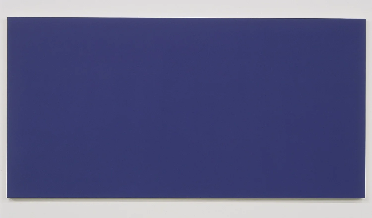
The arrangement of the paintings was determined by circumstances in the architecture of the gallery. An artist that had a show with Daniel and Christopher in this same space had told me that the walls were broken up. I thought this was an interesting thing. Paintings in the ordinary case assume an uninterrupted expanse of wall. By happenstance I had recently made some notes about the idea of a painting in several parts on walls that are at different distances. But the edges of these different parts coincide so they are seen as one painting. When I saw the plan of the gallery, I settled on the idea of having the short break in the west wall divide a painting in two. Ordinarily you would want to keep a painting well away from such a disruption: a painting wants an uninterrupted wall that offers the painting to view while disappearing from our awareness. My thought was just the opposite: why not hang the painting so that it runs across this break and so calls attention to it? A feature in the architecture that to conventional thinking is where you don’t hang a painting becomes the place where you do.
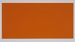
This meant dividing the painting in two, so that one half is to the left of the break and the other half to the right. The two halves are separated from each other by the depth of the break. I consider these two physically separate panels, both the same blue, to be one painting. And on the wall opposite the blue painting is the painting that is the complement of blue, that is, orange. These two paintings (one of which is in two separate parts) together are a pendant pair and are one work.
The Pendant Pair Paintings go beyond painting as usual by returning to a time before the easel picture emerged as the dominant form of painting. Before this emergence, paintings were largely made in relation to architecture. The architecture came first, then came the paintings. The painter made the best of the situation as he or she found it. What motif, in what composition, best suits this lunette? When the work is properly fitted to the space that the artist was given to work with, you don’t see the painting as being imposed on or limited by the architecture; the painting has an autonomy that we can call conventional. For the Pendant Pair Paintings, I sought out elements in the architecture that would impose themselves on the paintings; more than impose themselves, they would make the work. There was plenty of wall space in the gallery, and so plenty of space to hang paintings. But the Pendant Pair Paintings don’t use the walls in the usual fashion. Instead the Pendant Pair Paintings are determined by the architecture in a negative sense. The paintings don’t overcome the architecture and subordinate it, they bring it out. And in bringing out the architecture, the Pendant Pair Paintings acknowledge that aspects of the architecture ordinarily hostile to the hanging of paintings determined the placement of the paintings and in turn determine the overall arrangement.
When you look at the blue painting, you see that the two halves are at different distances. The image of the farther one is smaller on your retina than the image of the closer one, and your stereoscopic vision shows you the difference in distance too. You can’t see the two halves of the blue painting as being the same distance away and hence in one plane. Human vision can’t help seeing the depth in the scene it is looking at; it can’t make the depth in a scene disappear.
But there is a kind of technical drawing that makes depth disappear. It is called orthographic projection, and it is the projection that is used to draw, for example, a building elevation. In orthographic projection everything is drawn without its size being affected by how close it is or how far away, as is the case with perspective. We know that in a perspective drawing all the telephone poles are the same height, but the telephone pole in the distance is smaller in proportion to its distance from the nearer one. The relative sizes tell us something about the distance between them.
In an orthographic projection, two things that are the same size, for example, telephone poles or the two halves of the blue painting, are the same size on the paper, even though one is farther away than the other. (They will be the same size on the paper no matter how much farther away the farther one is.) And in orthographic projection every point on the paper is seen as if you are looking directly at it. So in orthographic projection the two halves of the blue painting would appear to be in one plane, and hence continuous with one another.
In orthographic projection, depth disappears. You obtain the information about the distances that separate the surfaces from looking at another view of the same scene. When you look at an orthographic view with this additional knowledge, you understand that the surfaces are at different distances. This knowledge that you have gained elsewhere (usually from a second drawing that shows the subject from the side) enables you to supply the differences in distance in the drawing. What you know from elsewhere enables you to see the differences in distance even though they are not directly represented in the drawing you are looking at. You assemble the information you need to construct your understanding of an orthographic projection over time.
Orthographic projection is a convention for drawing objects that is radically different from human vision. Vision is perspectival, and in perspective the size of things change in accordance to how far away they are. The same object far away is smaller than the same object closer. Human vision is a view of a space with objects in it, and space is exactly what is absent from orthographic projection. But orthographic projection is something that when you see it you understand without thinking about it. You look at an orthographic projection of the front of a building and you understand it. Never mind that if you stood in front of the building and looked at it, it couldn’t look the way it does in the drawing. You can’t see in orthographic projection, but because the concept is so readily understood you can imagine the orthographic without having to draw it. You understand how it is possible to see the two halves of the blue painting in such a way that they are in the same plane and hence continuous with each other, even if this is not what you see when you look at the painting.
The Pendant Pair Paintings show, in theory at least, the properties of orthographic projection but realized in the space of human vision. The paintings are as if moved from orthographic projections to the walls of the gallery, bringing with them the orthographic projection in which they were drawn (as if it were possible to do this). The work invites you to visualize what you are looking at on the walls of the gallery in a way that is radically different from how it appears to you.
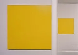
There was a second break, or disjunction, in the east wall, even more drastic than the first. It’s so drastic that it is an act of imagination to call it a break instead of a wall. But once you understand that distance doesn’t figure in the orthographic, it’s easy to ignore displacements in depth, however great. In orthographic projection depth isn’t visible (not directly), so the depth between the two walls disappears. This break separates the two halves of the yellow painting. The two halves of the yellow painting are far more displaced from each other than those of the blue painting, but like the blue painting the yellow painting is one painting. The painting that is the complement of yellow, violet, goes exactly opposite it.
The distance between the adjacent pendant pairs is equal. The centerlines of the first two pendant pairs (blue/orange, violet/yellow) are separated by the distance between the breaks in the opposing walls. The distance from the center of the violet/yellow pair to the center of the third pair, red/green, repeats this same distance. The placement of the paintings in relation to the walls and in relation to each other was determined entirely in advance.
Painting as usual readily cooperates with being photographed. The painting is rectangular and so is the frame in the camera. One painting, one photograph. The space between the camera and the painting disappears. All you see is the painting, which is to say that in a photograph you see the painting as you never would in actuality. To me it is a distinction of the Pendant Pair Paintings that they cannot be rendered in a single photograph, in that way that almost all paintings make possible (make possible almost too readily, I might say). If a painting is not rectangular, there is not a problem; you show the whole painting, even if that means you include parts of the wall that it is hanging on. (I find what is in this margin between the edges of the painting and the edges of the photograph useful because, for one thing, it can give a sense of the painting’s size in the photograph itself, not as dimensions in the caption. And at least there is more in the photograph than the painting, so you see the painting for what it is, an object on the wall.)
In fact the Pendant Pair Paintings cannot be rendered in photographs at all. You can’t take a single photograph that includes both members of these pendant pairs, and a single photograph can’t capture the activity that is necessary to view them, when you stand between them and look first at one, then turn and look at the other. You are in a space, and your experience of the paintings is an experience not just of the paintings as colors within rectangles but as paintings in relation to each other and in relation to you in the space that you and the paintings are in. Putting a photograph of each painting in a pendant pair side by side would falsify the work because it would eliminate the experience of having to view the paintings one after the other and having to turn to do so, an act that makes you aware of your body and can only take place in time, things that such a pair of photographs could not show. And in a photograph of a single painting that is in two halves (the blue painting and the yellow painting) the perspectival view that a photograph automatically is would make it difficult for you to visualize for yourself these paintings as orthographic. You would see the distance that separates the two halves in space instead being able to put aside what you see with your eyes and replace it with a visualization that sees the two halves in the same plane and so as two surfaces that are continuous with one another.
The Pendant Pair Paintings underline what we already know but too often forget, and that is the radical difference between a painting and a mere photograph of it, which can only be an image of the painting.
As the drawings that accompany the Pendant Pair Paintings suggest, it is possible to depict the Pendant Pair Paintings in several different ways. No one of these several ways is a comprehensive representation of the paintings as they are on the walls of the gallery, much less the experience of looking at them. Each can only bring out different aspects of the paintings. You can see the Pendant Pair Paintings only by looking at them, experiencing them, in actuality.
Morgan Fisher


Morgan Fisher
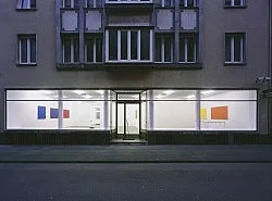
“Pendant Pair Paintings”
installation view Galerie Daniel Buchholz, Köln 2007

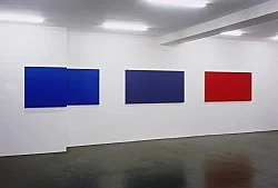
Morgan Fisher
“Pendant Pair Paintings”
installation view Galerie Daniel Buchholz, Köln 2007

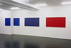
Morgan Fisher
“Pendant Pair Paintings”
installation view Galerie Daniel Buchholz, Köln 2007

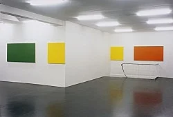
Morgan Fisher
“Pendant Pair Paintings”
installation view Galerie Daniel Buchholz, Köln 2007

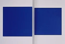
Morgan Fisher
“Pendant Pair Painting (blue/orange)”, 2007
1 of 2 works, acrylic on canvas on wood
2 parts, each 100 x 100 cm
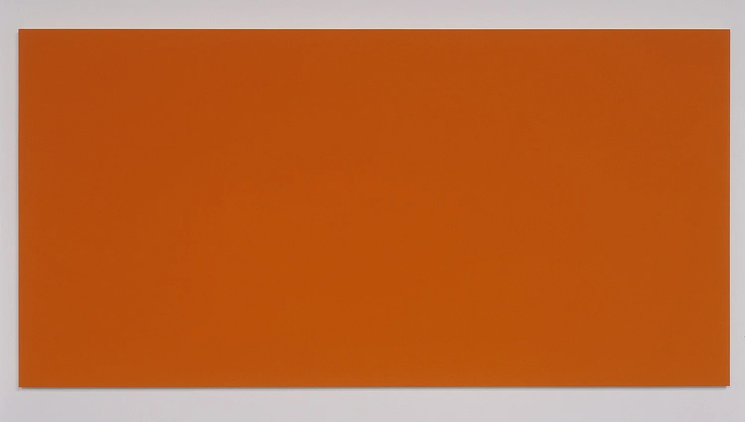
Morgan Fisher
“Pendant Pair Painting (blue/orange)”, 2007
1 of 2 works, acrylic on canvas on wood
100 x 200 cm
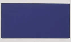
Morgan Fisher
“Pendant Pair Painting (violet/yellow)”, 2007
1 of 2 works, acrylic on canvas on wood
100 x 200 cm

Morgan Fisher
“Pendant Pair Painting (violet/yellow)”, 2007
1 of 2 works, acrylic on canvas on wood
2 parts, each 100 x 100 cm

Morgan Fisher
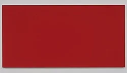
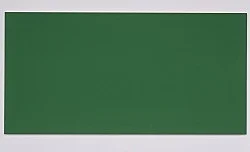
“Pendant Pair Painting (red/green)”, 2007
1 of 2 works, acrylic on canvas on wood
100 x 200 cm

Morgan Fisher
“Pendant Pair Painting (red/green)”, 2007
1 of 2 works, acrylic on canvas on wood
100 x 200 cm